Download These 40 Free Out of Service Sign Printable PDFs for Instant Use
When equipment or facilities suddenly become unavailable, having a clear, visible sign is crucial. Our downloadable Out of Service Sign templates offer a fast, printable solution for communicating disruptions. Whether you’re managing a restroom closure, a broken vending machine, or faulty electronics, these signs help you inform others quickly and professionally.
General Out of Service Sign Printable for Offices and Retail {#general-signs}
These out of service sign printables are perfect for equipment, doors, or displays in offices and shops. I used one for my office printer, and it stopped everyone from trying to use it! Here are some designs with different fonts and colors:
Let’s take a closer look at the available templates and how they can be used effectively in different situations.
Explore Each Out of Service Sign Design
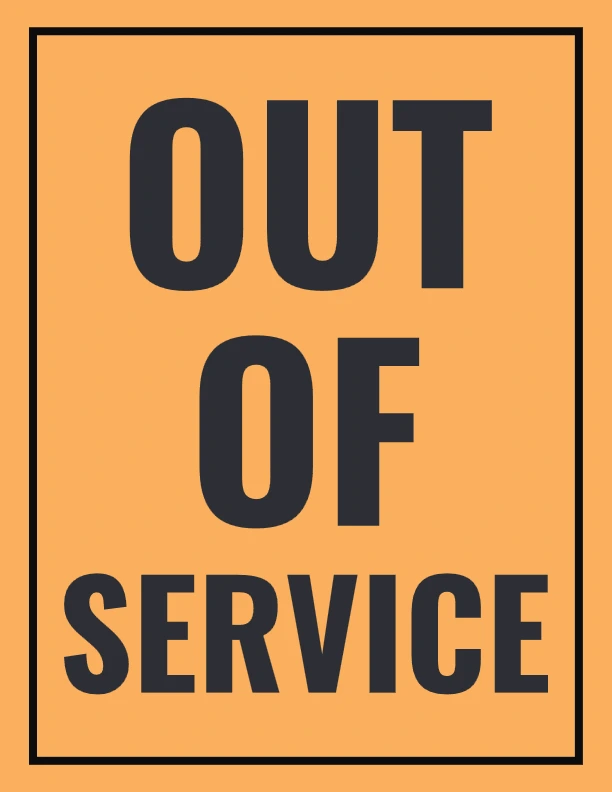
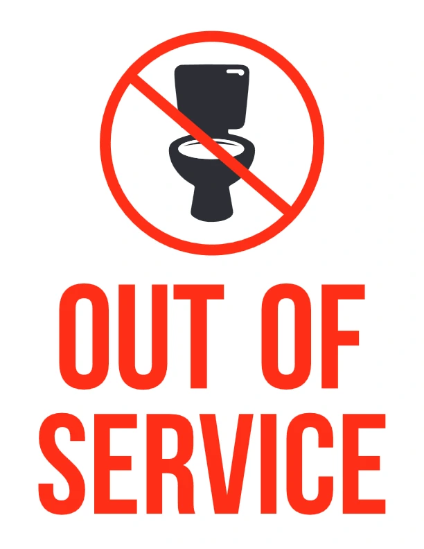
🧾 1. Artboard 1 – Simple Block Lettering
Description: Clean design with centered text, emphasizing the message without distraction.
Audience: General workplace use, schools, or restrooms.
Benefits: High readability ensures the sign grabs attention immediately.
🏷️ 2. Artboard 2 – Framed Alert Format
Description: Uses a bordered format for added structure and visibility.
Audience: Offices, elevators, and breakroom appliances.
Benefits: Ideal for high-traffic areas needing a bold visual.
📣 3. Artboard 3 – Bold Emphasis Style
Description: Features large, capitalized font with spacing to ensure quick readability.
Audience: Retail or hospitality businesses.
Benefits: Effective in environments where fast communication matters.
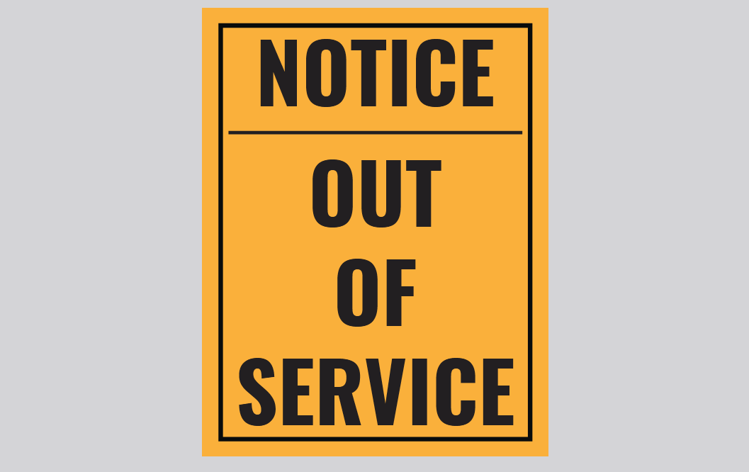
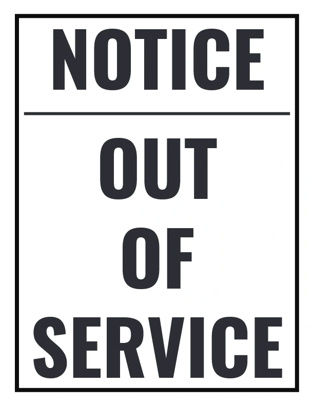
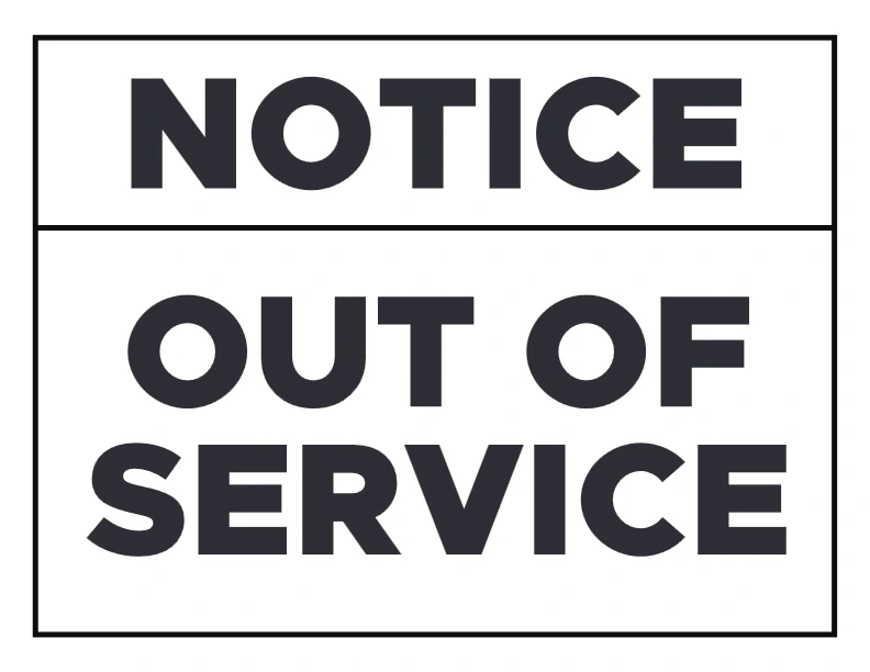
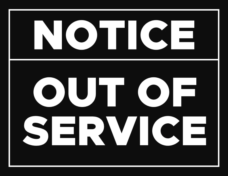
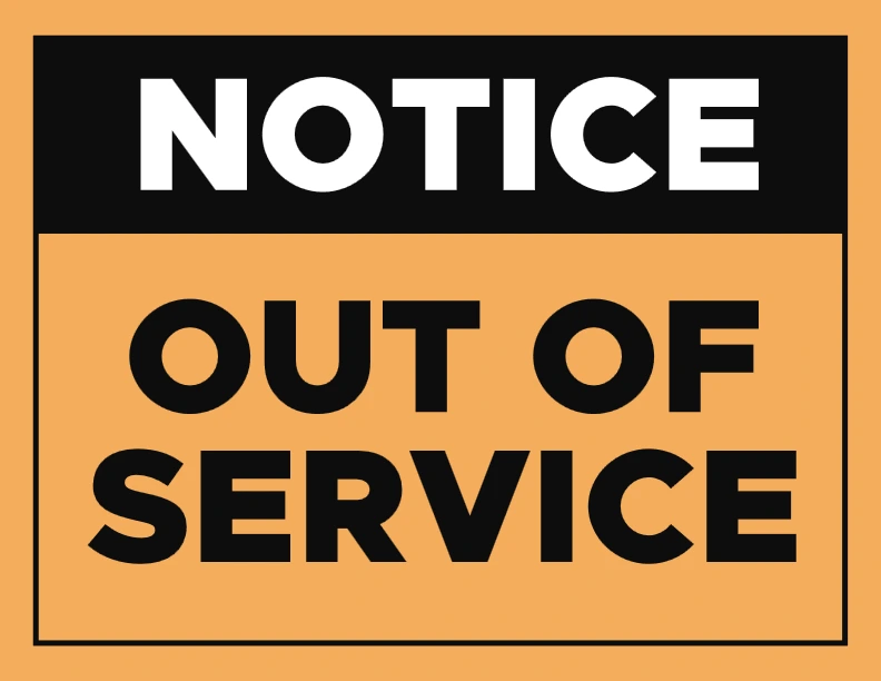
🚫 4. Artboard 4 – “NOTICE” Header Format
Description: Includes a “NOTICE” header, emphasizing official communication.
Audience: Industrial or public settings.
Benefits: Adds authority and seriousness to the message.
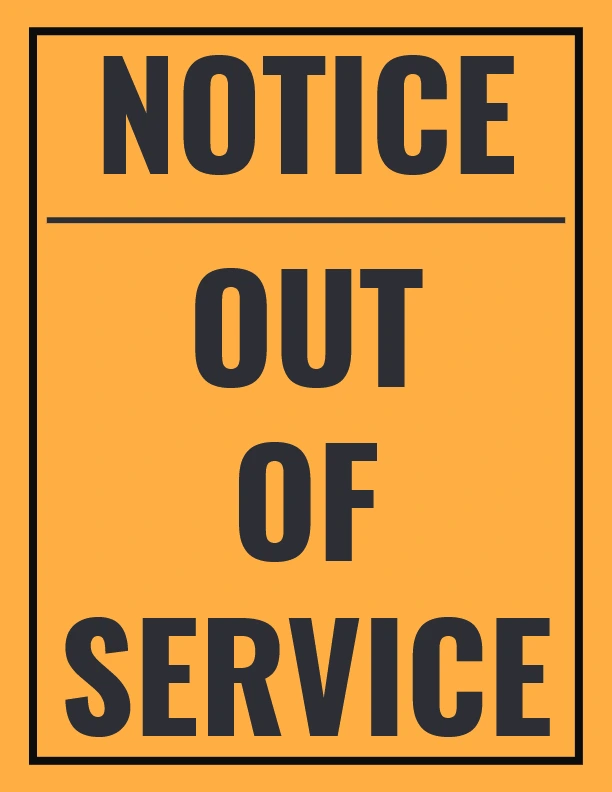
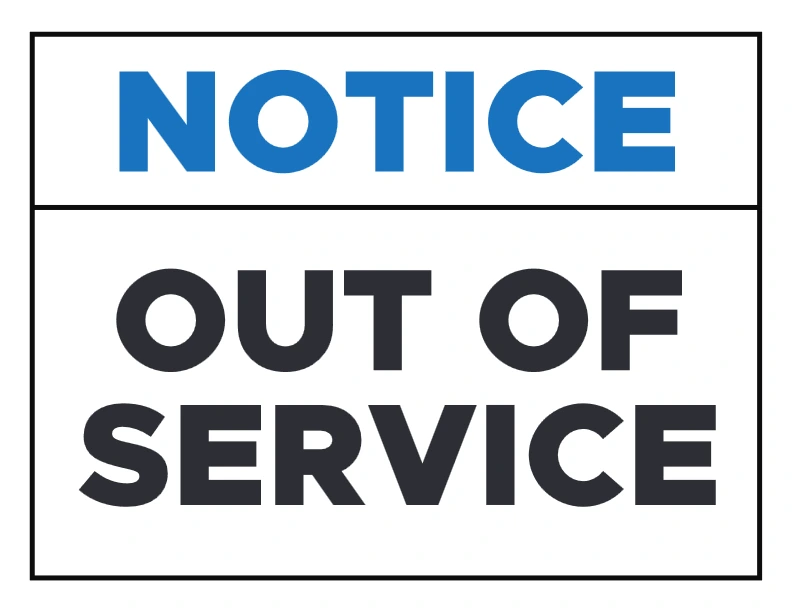
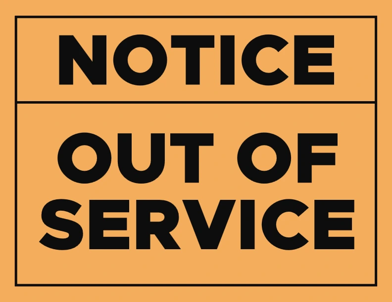
📌 5. Artboard 5 – Duplicate Notice Layout
Description: Slight variation of Artboard 4 with similar format—great for multiple placements.
Audience: Maintenance teams, warehouse floors.
Benefits: Provides consistency when posting signs across several areas.
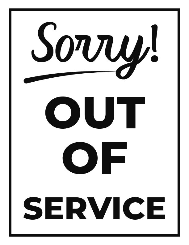
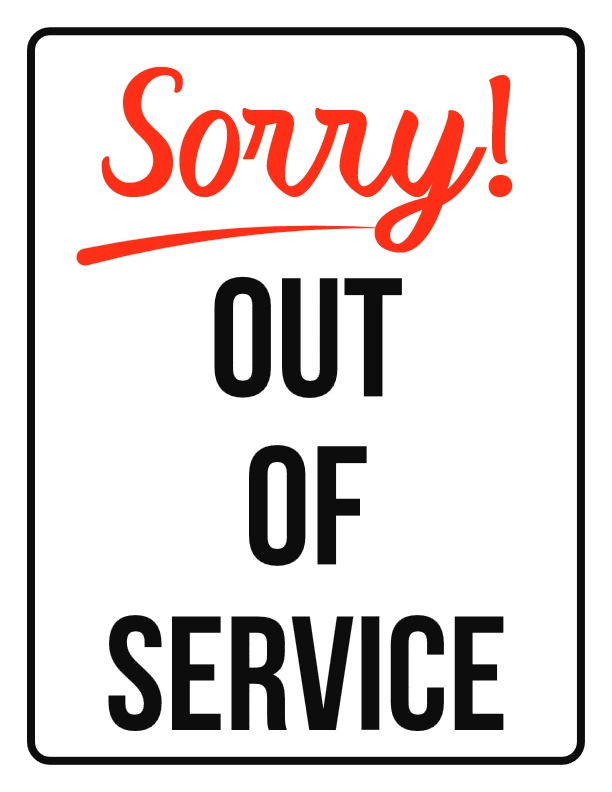
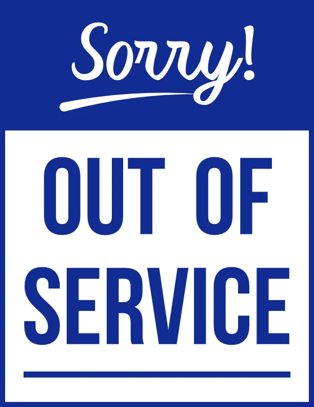
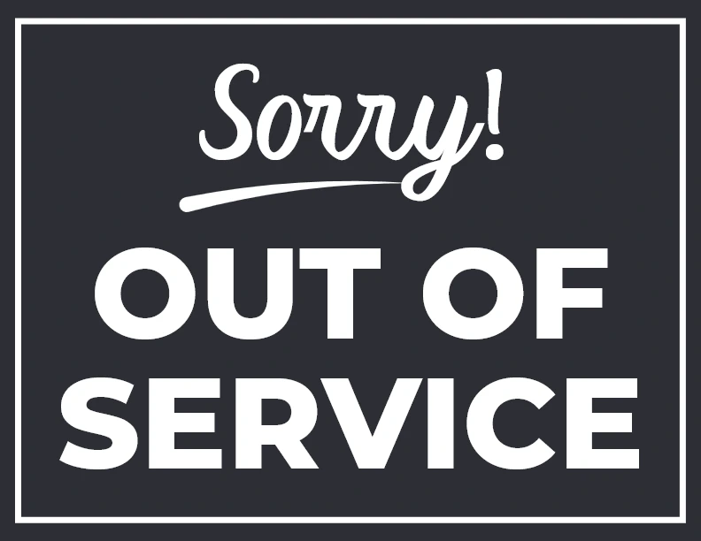
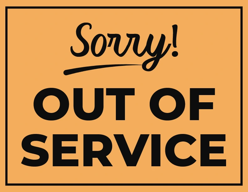
🙏 6. Artboard 6 – Apology Included Version
Description: Ends with “Sorry!” to add a polite touch to the message.
Audience: Customer-facing spaces like restaurants or shops.
Benefits: Encourages understanding and reduces customer frustration.
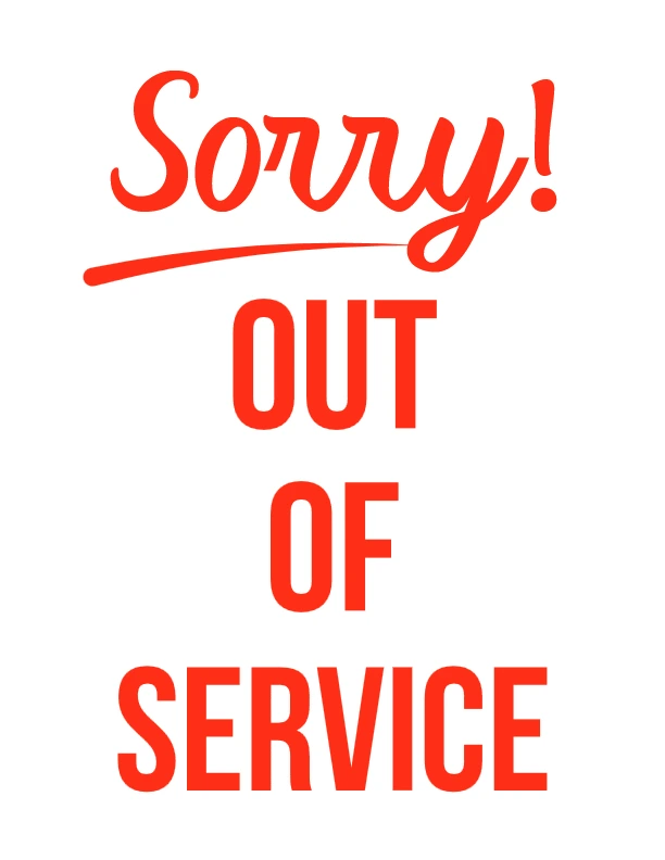
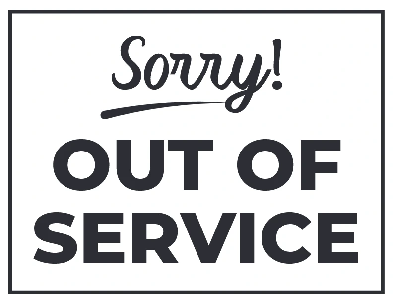
💬 7. Artboard 7 – Minimal “Sorry!” Style
Description: Uses only the word “Sorry!” in bold script—works as a supplement to other signage.
Audience: Informal environments, cafes.
Benefits: Simple and non-intrusive, softens the impact of inconvenience.
🖨️ 8. Artboard 8 – Repetition for Emphasis
Description: Repeats “Sorry!” visually to enhance the empathetic tone.
Audience: Small businesses and customer service counters.
Benefits: Expresses genuine concern, which improves user experience.
📢 9. Artboard 9 – Repetitive Format with Decision Box
Description: Combines apology and structure for user reassurance.
Audience: Customer-oriented businesses.
Benefits: Signals downtime while showing accountability.
🧱 10. Artboard 10 – Heavy Block Design
Description: Uses thick fonts and tight spacing—ideal for outdoor or dim areas.
Audience: Construction zones, outdoor venues.
Benefits: Maximum legibility from a distance.
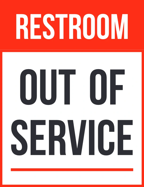
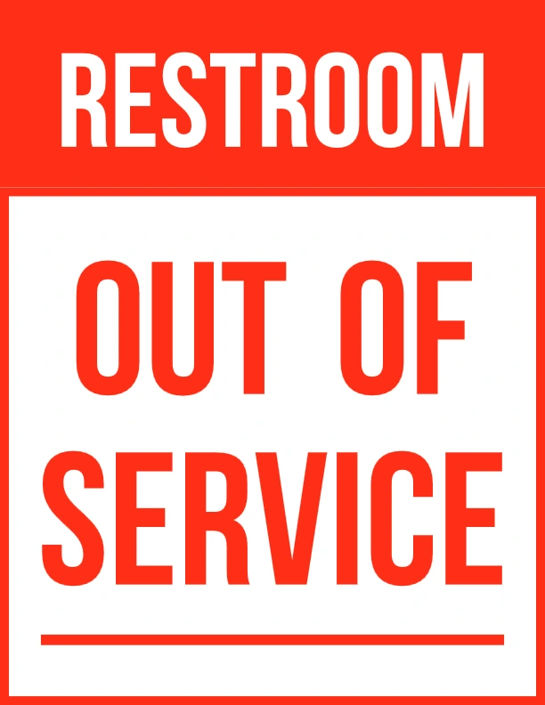
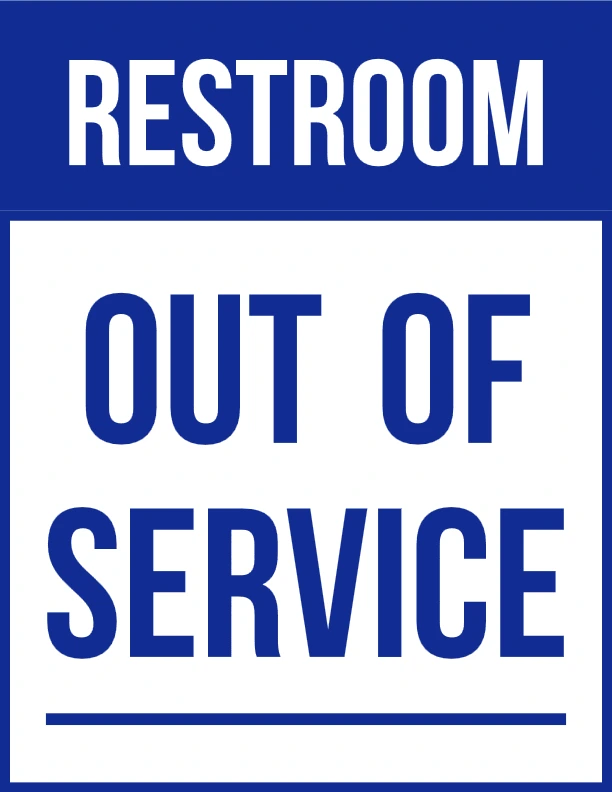
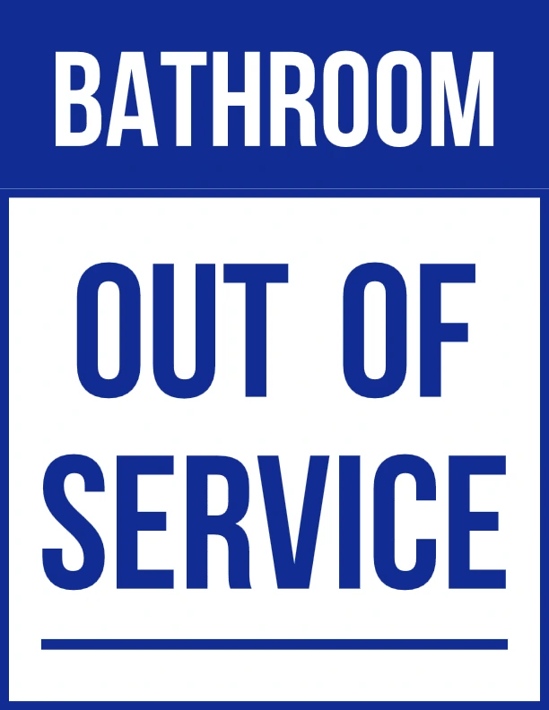
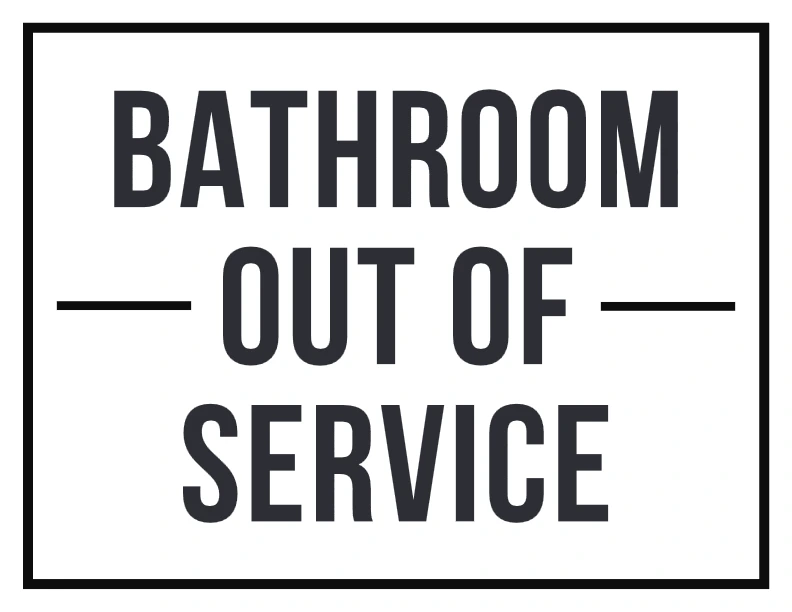
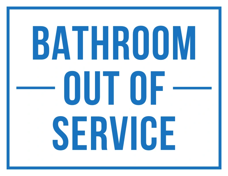
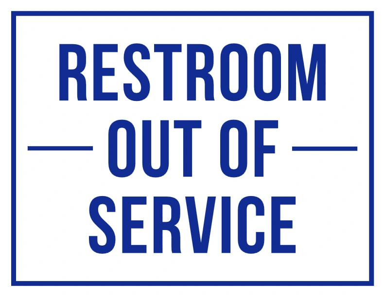
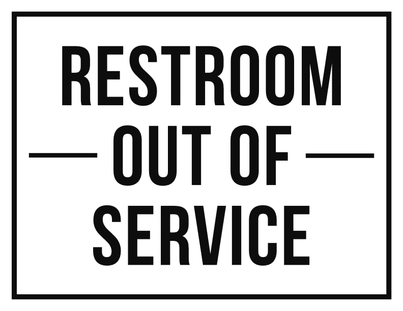
Restroom Out of Service Sign Printables for Public Spaces {#restroom-signs}
Running a café taught me that a broken restroom needs a clear sign to avoid awkward customer moments. These restroom out of service signs are perfect for restaurants, malls, or offices. Here are some designs:
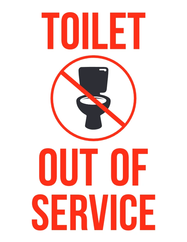
🧰 1. Artboard 1
Description: This design uses a clear red “X” symbol with bold “Out of Service” text, making it perfect for industrial equipment or office printers.
Audience: Maintenance staff, office administrators.
Benefits: Quickly communicates non-functionality to prevent misuse or confusion.
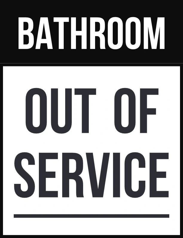
🚻 2. Artboard 2
Description: This sign adds a “Temporarily Unavailable” subtitle, ideal for restrooms or locker rooms.
Audience: Public facility managers, school janitors.
Benefits: Reduces user frustration by setting expectations.

🚫 3. Artboard 3
Description: A minimal black and white design—great for professional or formal settings like medical or legal offices.
Audience: Healthcare and business environments.
Benefits: Sleek and serious tone keeps environments looking orderly.
🏭 4. Artboard 4
Description: Bold yellow background with a gear icon, signaling mechanical issues.
Audience: Factory floors, warehouse managers.
Benefits: Stands out in visually noisy environments.
🏢 5. Artboard 5
Description: Includes bilingual English/Spanish text, making it accessible to diverse staff.
Audience: Multilingual workspaces, hospitality industry.
Benefits: Promotes inclusion and clear communication.
📷 6. Artboard 6
Description: This one features a camera icon—great for marking photo booths or electronics.
Audience: Event organizers, tech spaces.
Benefits: Specific enough for targeted applications.
🛠️ 7. Artboard 7
Description: A construction-themed sign with a wrench icon—ideal for tools or repair areas.
Audience: Contractors, maintenance teams.
Benefits: Instantly recognizable in trades-related settings.
⛔ 8. Artboard 8
Description: Uses a large stop sign icon for urgent messaging.
Audience: Public areas, hospitals.
Benefits: Commands attention and deters entry immediately.
🔌 9. Artboard 9
Description: Electric plug graphic—best for electronics, chargers, or kiosks.
Audience: IT departments, retail.
Benefits: Prevents attempted use of malfunctioning items.
💡 10. Artboard 10
Description: A lightbulb icon suggests temporary electrical failure.
Audience: Office managers, maintenance workers.
Benefits: Communicates downtime while reducing safety risks.
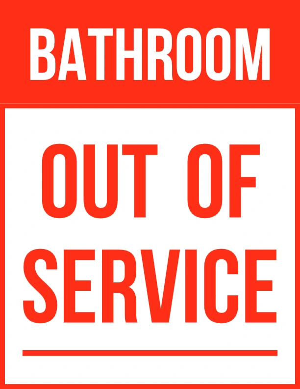
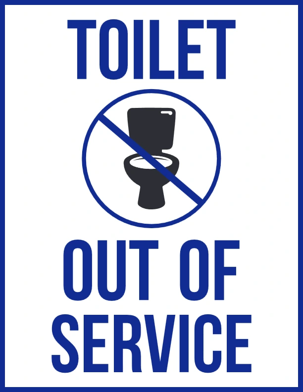
Toilet Out of Service Signs for Homes {#toilet-signs}
When my home toilet broke during a family party, a toilet Out of Service Sign Printable saved me from endless explanations. These signs are perfect for homes or small businesses. Here are some designs:
🔹 1. Standard Utility Notice
Description: A practical, no-frills sign stating “Out of Service Sign Printable” in bold, centered text.
Audience: Utility managers, janitorial staff.
Benefits: Perfect for quick deployment in restrooms or behind-the-scenes work areas.
🔹 2. Polite Apology Style
Description: Simply says “Sorry!”—meant to soften the inconvenience.
Audience: Customer-facing businesses and hospitality venues.
Benefits: Adds a courteous tone, especially in service-oriented environments.
🔹 3. Minimalist Bold Block Format
Description: Uses thick block lettering with high contrast.
Audience: Factories, garages, or high-noise environments.
Benefits: Ensures visibility even from a distance or in dim conditions.
🔹 4. Framed and Structured Layout
Description: A framed layout that adds a sense of order and formality.
Audience: Government buildings, educational institutions.
Benefits: Makes the message look more official and reliable.
🔹 5. Large Letter Format
Description: Prioritizes font size for maximum attention-grabbing effect.
Audience: Outdoor use or events with crowd control.
Benefits: Great for open spaces where visibility is a concern.
🔹 6. Bold Black Letter Warning
Description: Uses red to denote urgency or potential hazard.
Audience: Technical work zones, electrical or mechanical repairs.
Benefits: Acts as both a notice and warning to avoid interaction.
🔹 7. Dual Language or Double Section Format
Description: Offers space for bilingual text or a second notice area.
Audience: Multilingual work environments or international venues.
Benefits: Increases accessibility and reduces misunderstandings.
🔹 8. Compact Format
Description: Compact layout suitable for small spaces like kiosks or lockers.
Audience: Gyms, breakrooms, libraries.
Benefits: Easy to fit in tight locations without losing legibility.
🔹 9. Icon-Enhanced Design
Description: May include visual elements like symbols or icons for extra clarity.
Audience: Public restrooms, airports, malls.
Benefits: Easily understood regardless of reading level or language.
🔹 10. Printable All-Caps Emergency Style
Description: All-uppercase layout with emergency-style font weight.
Audience: Emergency services, industrial locations.
Benefits: Conveys urgency and commands immediate attention.
Bonus Out of Service Sign Printables {#bonus-signs}
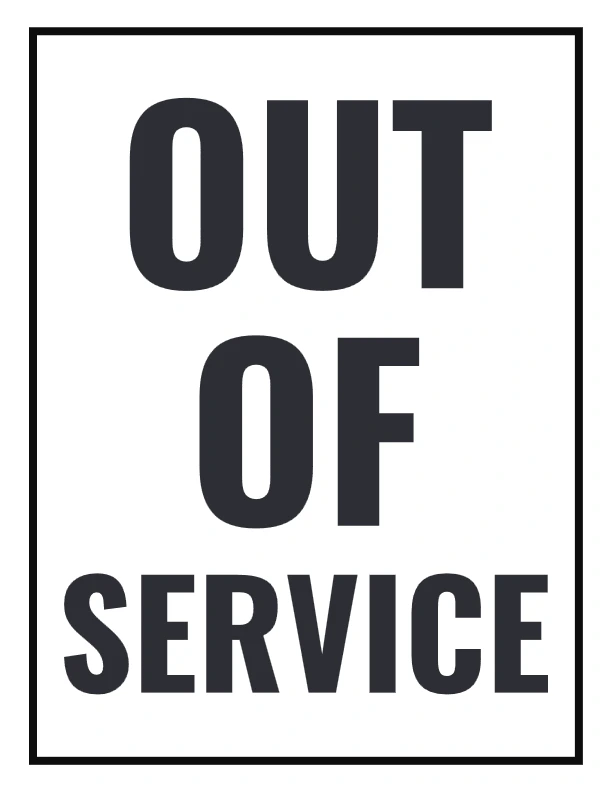
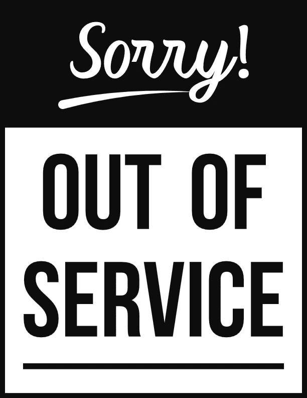
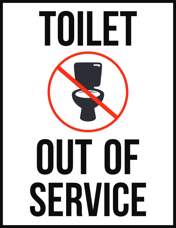
Design 1: Simple & Bold (PDF 1)
This design features clean, bold text with a classic Black and white layout. It’s highly readable from a distance and perfect for doors, elevators, or machines.
Target Audience: General public, office staff, maintenance teams.
Benefit: Offers high visibility and professionalism in any setting.
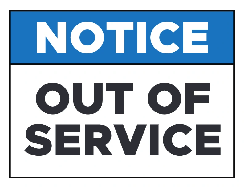
Design 2: Caution Stripe Style (PDF 2)
Framed with a yellow and black caution border, this design immediately draws attention.
Target Audience: Warehouses, factories, school students.
Benefit: Eye-catching format helps ensure safety by deterring entry to unsafe areas.
Design 3: Vertical Layout (PDF 3)
Designed for narrow or vertical spaces, such as restroom stalls or vending machines.
Target Audience: Retail and restroom facilities.
Benefit: Fits non-standard spaces while maintaining clear messaging.
Design 4: Bold style Message (PDF 4)
Includes “Out of Service” in Bold style —great for diverse communities.
Target Audience: Airports, international businesses, tourist areas.
Benefit: Increases accessibility and avoids miscommunication.
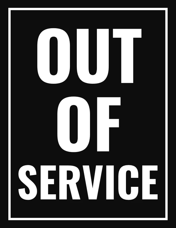
Design 5: Minimalist Black & White (PDF 5)
A sleek, ink-saving version that’s easy to print in bulk.
Target Audience: Offices, libraries, coworking spaces.
Benefit: Professional appearance with low printing cost.
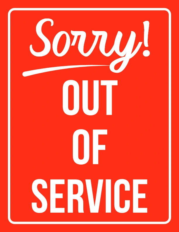
Design 6: “Sorry!” Friendly Note (PDF 6)
Combines a polite apology with the notification for a softer tone.
Target Audience: Service industries, restaurants, customer areas.
Benefit: Improves customer experience while still being informative
Design 7: Rectangular Edge Visuals (PDF 7)
Rectangular edge frames give this sign a modern and approachable look.
Target Audience: Medical offices, salons, schools.
Benefit: Friendly design that blends in with softer environments.
Design 8: High Contrast, Large Font (PDF 8)
Optimized for readability even from long distances or low light.
Target Audience: Parking garages, basements, outdoor equipment.
Benefit: Ensures visibility in challenging conditions
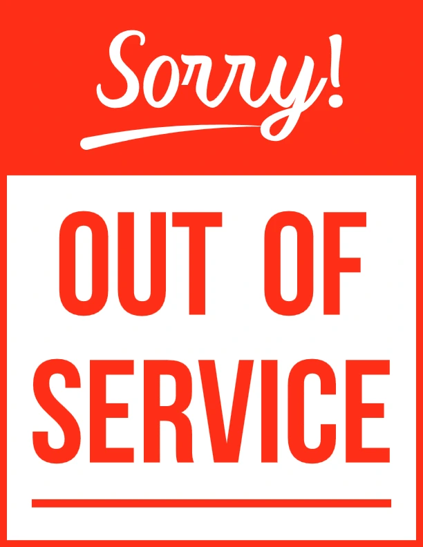
Design 9: Red notice Emergency Version
Pairs the “Out of Service” message with a universal caution icon.
Target Audience: Tech companies, public kiosks, digital signage, school areas and outside of the classrooms.
Benefit: Enhances understanding for non-native speakers or quick recognition.
Design 10: Corporate Branding Space (PDF 10)
Leaves a customizable area for logos or contact info.
Target Audience: Franchises, hotels, facility management companies.
Benefit: Combines utility with brand consistency and recognition.
How to Use These Printable Signs {#how-to-use}
I print these on A4 paper and tape them where needed—on printers, restroom doors, or home toilets. You can laminate them for reuse or use them digitally on a tablet. The out of service sign pdf designs are versatile, so pick the font and color that matches your vibe!
Why I’m Sharing These for Free {#why-free}
Good, free signs are hard to find, and I’ve been in enough chaotic situations to know how much they matter. These out of service sign printable have saved my office, café, and home, and I want you to have them too in your school, teachers and guardians will love it as well just as our coloring pages for kids. Whether you’re a facilities manager, retail employee, school administrator, or business owner, this free printable resource will save you time and help communicate effectively with anyone on-site. Keep reading to explore all ten sign designs and download your favorite with just one click!